
Case Study · Bell Media / CTV News
Web Navigation & Menu Structure
Restructuring a bloated 25+ item news dropdown into a clear, grouped hierarchy, using card sorting and IA research to build a navigation system readers could actually use.
Case Study · Bell Media / CTV News
Restructuring a bloated 25+ item news dropdown into a clear, grouped hierarchy, using card sorting and IA research to build a navigation system readers could actually use.
01 · Problem
This came up during a broader CTVNews.ca redesign that also included a CMS migration. The News dropdown had grown to 25+ items with no grouping, no hierarchy, and no logic. Users had to read the full list every time.
The new CMS added a constraint: the old dropdown pattern was no longer supported. But it did allow L1 and L2 categories to surface together on the L1 page. The work shifted from tidying a menu to rethinking the full navigation hierarchy inside a new system.

CTVNews.ca homepage, showing the News dropdown as it existed before the redesign
The problem
02 · Alignment
When the grouping conversations started, suggestions were coming from personal preference rather than reader logic. I flagged it to the PM and proposed taking the question out of the room. We ran a card sort with real readers and came back with findings to anchor the next discussion.
03 · Research
I ran a two-phase study to understand how readers actually grouped content.
Participants grouped all navigation items however felt natural, then named each group themselves. No categories were provided. This surfaced unbiased mental models and reader-facing language the team hadn't considered.
Participants sorted the same cards into pre-defined categories based on patterns from the open sort. This validated which groupings had consensus and where edge cases needed a judgment call.

Study plan: open + closed card sorting exercise with 15 regular CTV News readers
04 · Findings
The card sort surfaced clear consensus groups that became the foundation for the new IA. Participants consistently clustered content by topic and theme, not by the internal org structure the existing nav reflected.
Canada & Politics
World
Business
Life & Culture
Science & Tech
Local
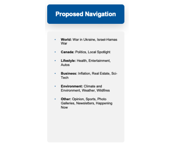
Screenshot of proposed navigation shared with stakeholders, based on insights from the card sort.
Before running any research, I put together a proposed navigation structure and brought it into a meeting with product and editorial. Rather than let that conversation settle on opinion, I proposed taking it to real readers first and letting the data shape the structure.
05 · Information Architecture
With card sort data analyzed, I built a formal IA structure defining Level 1 (top nav), Level 2 (grouped sections within dropdown), and Level 3 (destination pages). Every item had to belong somewhere meaningful.

| Level | Role | Example |
|---|---|---|
| Main Nav | Top-level navigation tabs visible across the site. The primary entry points readers see before opening any dropdown. | News · Video · Shows · Local |
| L1 | Category sections within a dropdown. Grouped by topic, visually separated, based on card sort clusters. | World · Canada · Lifestyle · Business |
| L2 | Destination pages beneath each L1 section. Individual topics using reader-facing language, not internal team labels. | Russia-Ukraine War · Federal Politics · Real Estate |
06 · Solution
The flat list was replaced with grouped sections using the card-sort-derived structure. Readers could scan to the right cluster and navigate directly, no more reading every item top to bottom.

The News dropdown rebuilt into labeled L2 sections based on card sort clusters. Readers scan to the right group, not through every item.
Labels matched the language from the open card sort, matching how readers described content rather than internal team labels.
Regional pages grouped under a "Local" L2 header instead of listed individually at the top level, immediately reducing visual noise.
Business content that was split across two places in the old nav merged into one group, which is how nearly every card sort participant had organized it naturally.
06 · Solution
Sub-topics that were previously invisible now surface directly beneath their parent section. Readers no longer need to know they exist in order to find them.

Before: World showed no sub-topics in the nav. Categories like Russia-Ukraine War were buried with no visible entry point.
After: Related topics now sit directly beneath World, visible at a glance. Readers find what they need without already knowing where to look.
07 · Reflections
The project showed that small structural decisions add up quickly. Once we aligned on fewer, clearer categories grounded in user research, everything else followed.